Feel Therapeutics is working to make mental health care more science-forward. The company makes wearable devices, mobile apps and clinician dashboards to gather physiological, digital and clinical data. It recently raised a $3.5 million round and shared its pitch deck with me to take a closer look. Let’s get in there and see what the company got right in its fundraising efforts and where more attention is needed.
We’re looking for more unique pitch decks to tear down: here’s how you to get involved. Read all our 90+ Pitch Deck Teardowns here.
Slides in this deck
The company raised its $3.5 million round with a tight 11-slide deck. The company says the deck is as pitched, with the exception of some clients that were removed.
Cover slideProblem impact slideProblem slideTechnology slideSolution slideTraction slide (business metricsTraction slide (white papers and publications)Moat / Patents slideTeam slideAsk and Use of Funds slideClosing / Contact slide
Three things to love about Feel’s pitch deck
Feel Therapeutics has a pretty original deck, with some twists I rarely see. The company did a great job telling the overall story.
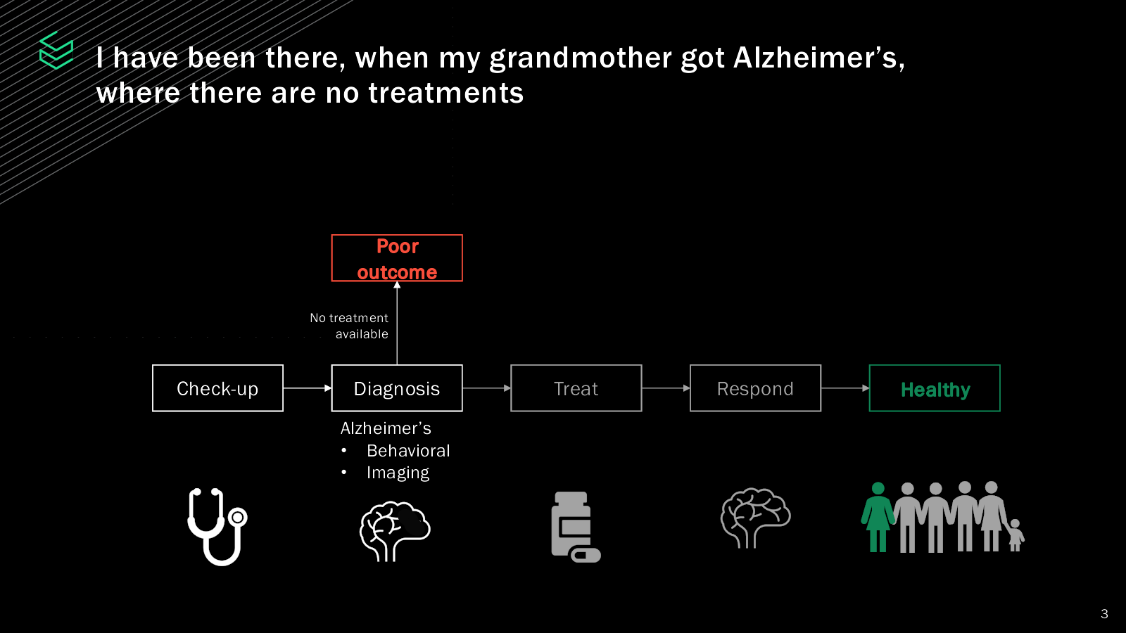
Why don’t we have measuring for mental health?
In the age of the quantified self, where your various devices track every aspect of your health, Feel Therapeutics makes an excellent point: Why don’t we track mental health?

I think this is a masterful way to start this conversation. “Hey, we track everything out the wazoo. Why not this?” is a great way to catch my attention.
A great overview
When startups are building a full platform or system to integrate many aspects of a company, things can often get a little messy. I was really impressed by how well Feel Therapeutics pulled together all the strands of the company on this one slide.

This brings up a really helpful general storytelling point: Starting with a 60,000-foot view and then getting more detailed is a smart move for fundraising pitches, especially when the business is complex. In this case, Feel Therapeutics begins with a broad overview, giving investors a general sense of the startup.
By starting with the big picture, it sets the stage and provides important context, making it easier for investors to follow along when you dive into the specifics. Jumping straight into the nitty-gritty can overwhelm or confuse investors, so this method helps keep them engaged and understanding. The key is to create “hooks” that you can hang more details on later — and it makes the storytelling more interactive. The investors can focus in on the things they don’t understand, and they can skip past the parts that intuitively make sense.
As you move through your pitch, gradually adding more specific details helps investors build on what they already know. This step-by-step approach ensures you’re not dumping too much info on them all at once. It also keeps their interest, as each new piece of information adds depth and color to your story. This gradual increase in detail makes your pitch more coherent because each part naturally follows the one before it, creating a smooth flow that guides investors through the complexity of your startup.
So does it work?

This slide does a great job of showcasing hard numbers, which are essential for demonstrating traction. Highlighting the fact that the company has 2,700 patients across nine countries is impressive and provides a substantial sample size to show the efficacy of the product. Overall, I think these figures indicate significant progress and can effectively capture investors’ attention by proving that their research has a broad and diverse reach.
I have some notes on this slide, though: It’s important to avoid medical jargon that might confuse or alienate some investors. I had to Google them, and that’s goofy: There’s plenty of space on the slide to just spell everything out. Terms like MDD (major depressive disorder), GAD (generalized anxiety disorder), and “therapeutic areas in CNS” might not be immediately clear to everyone. Simplifying or explaining these terms can make their slide more accessible and engaging for a wider audience.
The other point to note is that traction is even more compelling when shown over time. Including a timeline or progress graph could enhance the narrative, illustrating growth and momentum. Additionally, while patient numbers are a solid indicator of traction, revenue is the ultimate proof of business viability.
There’s no mention of financial performance on this slide, which raises questions about the business’s financial health. Including revenue figures or financial projections would provide a more complete picture of their traction and business potential. Yes, I realize that medical trials often aren’t a real business-forward process, but it’d have been good to know what the price sensitivity is in this space.
Three things that Feel Therapeutics could have improved
With an 11-slide deck, unsurprisingly, there’s quite a bit missing that investors would like to see. And, for that matter, there’s some stuff that’s there that could have been done better.
I fed the deck into my AI-based tool to see what the AI bots thought of the deck. You can see the full feedback here, but the most relevant piece is the summary:

The company missed out on the competition, which is probably the biggest miss here. There’s also no coherent go-to-market plan or operating plan. I get that the product is early in its cycle, but they should at least mention the business model and pricing they’re thinking of, alongside the target customer side of things. I’d have loved to see some unit economics, too: What happens when this product is manufactured at scale?
How to think about your competitor slide for your pitch deck
Interesting Ask and Use of Funds

The Feel Therapeutics team has included the terms of the investment on the “Ask and Use of Funds” slide, which is a bit unconventional. Typically, terms are left out because funding terms are negotiable and often depend on back-and-forth discussions with potential investors. But hey, it looks like they’ve already got a lead investor and are just trying to round out the funding round, so in this specific scenario, it does make some sense. Bear in mind, though, that this isn’t the norm, and for good reason: Negotiation is the name of the game in the investment world.
As for the “Use of Funds” section: It’s pretty loose and fuzzy, like a half-baked idea someone scribbled down on a napkin. Come on, Feel Therapeutics, you can do better than this! Investors want specifics, not vague promises. Get granular with how the money will be spent. It’s particularly confusing here, because I think the company took its milestones (Launch as a Drug+ and FDA approval) with milestones from other companies. I realize they’re probably trying to suggest this isn’t high risk, but there are also no times attached to the milestones.
In an ideal scenario, the “Use of Funds” should be summarized as SMART goals: specific, measurable, achievable, relevant and time-bound. Specific means clear and unambiguous. Measurable means you can track progress and know when you’ve hit the target. Achievable means it’s realistic (not some pie-in-the-sky dream). Relevant means it aligns with your broader business objectives. Time-bound means there’s a deadline. For instance, instead of “FDA approval,” a SMART goal would be “FDA approval under 510K by December 2025.” See the difference? One sounds like a solid plan; the other sounds like wishful thinking.
Why are SMART goals helpful in this context? Because they make you look like you actually know what you’re doing. Investors can see you have a clear roadmap and are not just throwing money at random initiatives hoping something sticks. It builds confidence and shows that you have a well-thought-out plan to utilize the funds effectively. So, tighten up those goals and give investors something tangible to get excited about.
This mess of a team slide

The Feel Therapeutics team has put together what looks like an impressive (if ugly) team slide, but let’s dive into the details to see how it holds up. First off, help investors understand why this team is the right team to lead this company. You’ve got some big names and titles thrown around, but what exactly makes them the perfect fit to drive this startup to success?
The “Industry Experts” and “Psychiatry Experts” sections look impressive at first glance, but are these individuals advisers? Are they part of the core team? How involved are they in the day-to-day operations of Feel Therapeutics? If they’re just high-profile names with loose connections to the company, that’s not as compelling as having them actively involved in strategic decisions and execution. Clarifying their roles and contributions would give investors a better sense of how these experts are enhancing the company’s capabilities.
The team member publications and citations are thrown in there, but these metrics feel like vanity stats. Sure, they look good on paper, but do they translate to actual business success? Investors want to see how the expertise of the team will drive tangible results for the company, not just academic accolades. Instead of focusing on these numbers, it would be more impactful to highlight specific achievements and experiences that directly relate to the company’s goals and market challenges. Show how this team’s unique blend of skills and experiences make it uniquely positioned to tackle the problems Feel Therapeutics is aiming to solve.
What’s the fundraising journey?
The other thing we should talk about is the company’s fundraising journey to date. Yes, it’s raising a $3.5 million round now, but it seems like it has already raised a bunch of money:

It appears that the company has raised a lot of capital, over many rounds (I’m counting eight different rounds of funding), but the company hasn’t reached proper growth yet. That’s not uncommon in medical devices, of course, but I’d want to understand what went wrong here and what the company has done to course-correct so it’s not needing to raise yet another bridge round in a year.
What the PitchBook data tells me above all is that this company really needs to start seeing some results, and soon. I’d also want to do deep diligence on the company’s cap table; who owns what in the company, and are the founders still adequately engaged to see them through the next stage of the business?
The full pitch deck
If you want your own pitch deck teardown featured on TechCrunch, here’s more information. Also, check out all our Pitch Deck Teardowns all collected in one handy place for you!