Pitch Deck Teardown: Kinnect's $250K angel deck

Image Credits: Kinnect

When Kinnect dropped a new app that’s all about preserving epic family tales and awkward holiday moments for generations to come, I knew I needed to take a closer look at its angel deck.

The app is clever and can be thought of as a digital family scrapbook on steroids. This app isn’t just about stashing photos; it’s also got video and audio recording, plus a nifty timeline feature to organize your memories like a pro. Kinnect’s grand plan is to make sure your grandkids get to hear straight from the source about that time Uncle Bob got stuck in a tree at the family reunion.

In a world where our heritage can get lost in the shuffle of everyday life, Kinnect is here to remind us that family stories are worth saving — and, of course, that’s all about storytelling. How well did the company tell its own story in the form of its angel pitch deck? Let’s take a look.


We’re looking for more unique pitch decks to tear down: here’s how you to get involved. Read all our 90+ Pitch Deck Teardowns here.

Slides in this deck

Cover slideTeam (founder) slideVision slideProblem slideProduct slideBusiness model and market size slideProblem impact slideMarket potential slideSolution slideWhy now / personal story slideTraction slide“Why will I win?” slide.Testimonial slide 1Testimonial slide 2

Three things to love about Kinnect’s pitch deck

The Kinnect pitch deck is playing on the heart strings in a big way, which is a great approach to storytelling when you are talking about startups that offer a human touch.

Powerful problem slide

[Slide 4] The problem slide is emotive, but a little fuzzy.
Image Credits: Kinnect

The problem slide in Kinnect’s pitch deck is compelling and well-executed. The team has clearly articulated a significant pain point, one that resonates deeply and is immediately relatable. The statistics cited are particularly impactful: Approximately 44 million American adults are significantly lonely, with about 30% of older adults feeling isolated. This alone paints a stark picture of the social isolation epidemic.

Even more powerful is the revelation that over half of Americans frequently feel misunderstood or unknown by those around them. The use of emotive and powerful language effectively underscores the urgency and magnitude of the issue, making it clear that this is a widespread and pressing problem.

However, while the problem identified is undeniably significant, it also feels somewhat nebulous. It’s hard to imagine a single product that can address all these diverse and deeply rooted issues of loneliness and disconnection. Tightening the focus of the problem statement might help in presenting a more cohesive and actionable solution. A slightly narrower and more focused problem could make the pitch even stronger and more believable.

Explain the impact of the problem

[Slide 7] Explaining how the problem affects people can help amplify things greatly.
Image Credits: Kinnect

The “Insights” slide in Kinnect’s pitch deck is a great example of powerful storytelling. By combining the problem with its impact, the team has effectively highlighted how big and important this problem really is.

Kinnect has painted a vivid picture of the problem’s effects, which helps investors understand the depth of the issue and dream big about the potential market for Kinnect. It makes the problem feel more tangible and sets the stage for the solution, showing that there’s a real and urgent need for what they’re building.

However, I also need to add that I don’t love this slide. Many parts of it can be seen as arguments against the app: Being unaware of existing solutions, for example, means that there may just not be a real market for this. And the differentiation between family and chosen family is a strange thing to highlight as an advantage. If distinguishing between the two is important to people, the competition could easily address this, so it isn’t as much of a competitive advantage as you might think.

A little more focus and clarity could help strengthen the argument.

A personal touch

[Slide 10] In addition to “Why now?” and “Why this?” adding a “Why you?” element to the story can be powerful. In this case, the personal stories help highlight why the founder has a connection to the problem the company is solving.
Image Credits: Kinnect

The “Why me?” type of information is typically included in the founder or team slide, but using it as a storytelling point here works well. Including the personal drive behind the venture can be incredibly powerful, as it explains why the founder will never give up on solving this problem.

Omar’s personal experiences — losing his grandfather to Alzheimer’s a few years ago and a friend to leukemia a month ago — are heart-wrenching and paint a vivid picture of his motivation. It shows that this is not just a business endeavor for him. It’s a deeply personal mission.

Founders, let’s get real. Every slide in your deck should scream, “Invest in me!” If it doesn’t, it’s dead weight. Sure, personal stories tug at the heartstrings, but investors aren’t here for that. They want to know why your sob story makes them money. The “Why Omar is doing this” slide? Sweet, but vague. If it doesn’t clearly tie back to why your company will crush it. It’s just fluff. Remember, if it doesn’t make an investor reach for their wallet, it doesn’t belong in your deck.

Three things that Kinnect could have improved

There’s a ton of information missing from the deck. Crucial details like the go-to-market strategy, user acquisition plans, specific team member credentials, and concrete milestones are absent. Filling in these gaps is essential to provide a comprehensive and convincing pitch. Use a checklist to make sure you have everything covered!

Dubious team

[Slide 2] 10 years of experience and passion is cool, but you’ve got to bring the receipts.
Image Credits: Kinnect

The “Founder” slide needs some polishing to really shine. Omar’s 10+ years of experience in performance brand and product marketing is impressive on the surface, but it’s crucial to tie that specific experience directly to Kinnect. Highlighting past roles or projects that are particularly relevant to the company’s mission would strengthen this slide significantly. Investors want to see how his background directly contributes to the success of Kinnect.

Omar doesn’t mention his last name anywhere in the deck, which raises a red flag. Investors need to be able to quickly look up and verify the founder’s background. Including his full name and a link to his LinkedIn profile would add credibility and transparency. Speaking of LinkedIn, it’s a bit concerning that Omar’s profile doesn’t reflect the 10 years of experience mentioned here. Ensuring that his LinkedIn is up-to-date and consistent with the information in the pitch deck is crucial. Investors will check, and inconsistencies can undermine trust. Without job titles and just a vague idea of how the founder’s past experience maps to the current venture, it’s all a bit fuzzy.

There also seems to be a lack of clear founder/market fit. The slide mentions a passion for storytelling, human connection and mental wellness, but it’s not immediately obvious how this translates into a strategic advantage for Kinnect. To wit: I, too, have a passion for storytelling, human connection and mental wellness, but I probably wouldn’t be a great founder for this particular startup. Get specific, connect the dots.

Drawing a direct line between Omar’s experience and the company’s goals will make this slide much more compelling. Adding more specific, verifiable information and making sure it’s consistent across all platforms would significantly improve the founder/market fit part of the story.

Pie-in-the-sky business model

[Slide 6] This is an aggressive bottoms-up market sizing. But I don’t believe it.
Image Credits: Kinnect

The “Subscription Model” slide presents an ambitious goal: a potential yearly subscription revenue of $204.8 million. That’s certainly venture-scale, so kudos for aiming high. However, there are several aspects that need further clarification and support.

My immediate response is that it’s going to be hard to find customers. I want to see predicates or comparable examples. This doesn’t feel like an urgent need, so showing other types of products or services that families are willing to pay $80 per year for would strengthen the argument. It’s essential to demonstrate that there is a precedent for this kind of spending — and I can’t think of any offhand.

The term “family” needs more definition in this context. What are we memorializing, and how does it resonate with potential users? It’s also unclear what Kinnect offers that can’t be accomplished by existing free services like Facebook. Basically, this deck doesn’t answer why families would choose to pay for Kinnect when they have free alternatives available.

Nowhere in the deck is there a go-to-market plan, which means that I’m further worried how the founders plan to convince customers to shell out $80 per year. Without a clear strategy, it’s difficult to see how they will reach and convert their target audience. Providing a detailed plan on customer acquisition and retention would make the deck far more compelling overall and this slide more believable.

Wait, this isn’t traction

[Slide 11] This isn’t really traction.
Image Credits: Kinnect

The “Traction” slide is supposed to showcase Kinnect’s progress, but it doesn’t quite hit the mark. Here’s why:

Stating that Kinnect is backed by TechStars through the Rising Stars Fund might sound impressive, but TechStars isn’t exactly in its golden era right now. Plus, raising money from an accelerator isn’t the slam dunk of traction it’s being made out to be. Investors want to see actual proof that people care about what’s being built, not just a pat on the back from an accelerator.

The slide claims the team is 100% working on Kinnect. What does that even mean? Have the founders quit their day jobs and are now living on ramen while they hustle? Founders being fully committed is the bare minimum; the slide should explain what this dedication has achieved.

There’s also the boast about recruiting a phenomenal founding team, but the team slide shows only one person, Omar. Where’s the rest of this supposed dream team, and what makes them phenomenal? Investors need names, roles and impressive backgrounds.

Then there’s the mention of being a member of Chicago’s 1871 innovation hub. Cool, but what does that actually mean? Why does being part of this hub give Kinnect a competitive edge? Without context, it’s just another buzzword.

None of these points really screams “traction.” Investors are looking for real, tangible progress, like user growth, revenue, partnerships — not fluff. It’s time to dig deeper and show the hard facts that prove Kinnect is on the path to success.

The full pitch deck


If you want your own pitch deck teardown featured on TechCrunch, here’s more information. Also, check out all our Pitch Deck Teardowns all collected in one handy place for you!

Pitch Deck Teardown: MegaMod's $1.9M seed deck

Image Credits: MegaMod

Welcome to our 100th pitch deck teardown! This week, I’m taking a look at MegaMod’s seed-stage pitch deck. MegaMod seems to be the latest darling of the gaming industry and just pocketed a cool $1.9 million, bumping its post-money valuation to $27 million. With a mission to revolutionize the game creation process, MegaMod says it plans to splurge on refining its go-to-market strategy and testing out its retention and monetization model.

In an industry where creators are often tossed aside like yesterday’s lootboxes, MegaMod swoops in with a heroic promise to put them front and center — a knight-in-shining-armor vibe that is slightly sullied by the very first screen on the company’s website.

Nothing shouts “we love creators” more than asking them to hand over the rights to everything they create on the platform. Not the best first impression.
Image Credits: MegaMod (screenshot)

So, what’s the real story behind MegaMod’s pitch deck that charmed investors and secured that $1.9 million? We’re about to dive deep, peeling back the layers of this pitch to see if it’s a critical hit or just another NPC in the startup landscape.


We’re looking for more unique pitch decks to tear down: Here’s how you to get involved. Read all our 100+ Pitch Deck Teardowns here.

Slides in this deck

MegaMod’s pitch deck clocks in at a tight 13 slides. That’s fewer than we typically expect, but who are we to judge? Oh, wait, judging is literally the point of these articles. Never mind, let the judging commence.

Cover slideProblem slideProduct portfolio slideProduct Overview slideProduct slide 1Product slide 2Product slide 3Product slide 4Value proposition slideTraction slideFinancial projections slideTeam slideAsk and Use of Funds slide

Wow, four product slides? I can almost guarantee that investors don’t care this much about your product. OK, fine. Let’s get started.

There’s one thing to love about MegaMod’s pitch deck

Dedicating 29% of a pitch deck to product slides isn’t great, and it’s clear that the rest of the deck isn’t that great either. But there is one thing that is.

A bold ambition

[Slide 2] The company seems to believe that there’s 50 million people cursing the heavens that they can’t make games.
Image Credits: MegaMod

Generation Z treats gaming like it’s a religion, not just a hobby. They’re glued to their consoles, VR headsets and mobile screens, diving into digital worlds with the kind of dedication usually reserved for cult leaders. This generation doesn’t just play games, though; they’re building entire universes, forming guilds and trash-talking their way to the top of leaderboards. Gaming isn’t just something they do; it’s who they are — and despite all of this, making games is hard.

Is that a problem? I have no idea. I kind of always assumed that making games was hard, but MegaMod seems to place a different bet: The company makes it clear that through its full suite of products, it’s making it stupidly simple for these gaming fanatics to create their own games. It’s an interesting bet, banking on Gen Z’s insatiable thirst for self-expression and DIY attitude. Why just play games when you can build them?

I love a slide that makes me question base assumptions, and this slide did that. Wait, why does it seem so hard to build games? Can games built in a day be any good? I reserve judgment, but I can’t help but admit that I’m curious!

Three things that MegaMod could have improved

I wrote a few of drafts of this paragraph in which I tried to find a silver lining, but in a nutshell: I can’t believe this company managed to raise a cent, let alone a respectable chunk of change.

The pitch deck reads like a ransom note scribbled by someone who forgot their glasses. Vital information? Missing in action, and what little info they do provide is flimsier than wet tissue paper. I’ve seen college entrepreneurship pitch decks with more substance.

Based on this deck alone, it’s a miracle anyone invested at all, which probably points to the fact that the company has something else going for it. I’m struggling to see what, though. Either it has some serious charm or its investors have a wild sense of humor.

It’s likely that there’s something to the company that doesn’t come through in the deck. Either the founders know the investors, or there’s a piece of traction or a go-to-market mechanic that isn’t explored in the deck. But that’s the fun thing about this series: I’m not talking to investors or founders; I’m critiquing the deck based on what is there, especially because a pitch deck should be able to stand on its own.

What the hell is going on with this product?

[Slide 4] MegaMod’s building out quite a product suite.
Image Credits: MegaMod

Slides 4-8 of MegaMod’s pitch deck are an exercise in being overly ambitious, making even the most seasoned entrepreneurs cringe. Instead of focusing on a single product or even a couple of well-developed offerings, MegaMod has decided to throw everything at the wall to see what sticks. Six products, including a game engine, AI coding tools, a skins editor, a prop editor, an in-game library and a social platform. And if that wasn’t enough, they’ve got a marketing tool (MegaGames), tools for streamers, distribution tools and more. It’s as if they went on a shopping spree at the tech store and decided to buy one of everything, just in case.

Here’s the thing: Startups need focus. Spreading yourself thin across so many product lines is a recipe for disaster. Any single one of these products — be it the game engine, the AI coding tools or the social platform — could be fully viable startups on their own. Each requires dedicated resources, specialized knowledge and a clear strategy. Instead, MegaMod is trying to juggle all these balls at once, and it’s hard to see how it won’t drop a few — or all — of them. The lack of a focused approach screams hubris more than it does competence.

One could argue that combining all these tools into a single suite might leverage network effects, creating a cohesive ecosystem that’s greater than the sum of its parts. But here’s the kicker: The deck doesn’t make that argument. At all. We’re left guessing at how these disparate products should interact, let alone how they’ll generate revenue. It’s unclear what the monetization model is for any of this. Is the company banking on subscriptions, one-time purchases, ads or some magic beans? Without a clear path to profitability, MegaMod’s grand vision feels more like a pipe dream than a solid business plan. Investors are left with more questions than answers, and that’s a surefire way to keep the funding at bay.

Where’s your traction?!

[Slide 10] This is the closest the company has to a traction slide, but all I see are vanity metrics.
Image Credits: MegaMod

MegaMod boasts having 2,500+ creators who have churned out an impressive 65,000+ games. On the surface, these numbers seem promising, but on second glance, they feel deliberately opaque, as if the company is trying to distract us with volume rather than substance. If the average creator has made 26 games (wow!), we need to ask some critical questions. Who is playing these games? Are they any good?

A large number of creations doesn’t mean much if the games aren’t engaging players or generating revenue. Without knowing the quality and popularity of these games, it’s hard to assess the actual impact MegaMod is having in the gaming community. I guess the best comparison I can come up with is this: The average three-year-old is probably making 26 paintings per quarter. But their revenue is going to be incompatible with a venture-scale business.

The next slide projects an ambitious $170 million in ARR by 2028, which is great, but there’s a glaring omission: current revenue numbers. What’s the average revenue per player right now? How is MegaMod generating income now, and why are those details absent? It’s easy to make lofty projections, but investors need to see a track record of growth and current financial health to believe in such an aggressive forecast. Without these key metrics, the projection feels more like wishful thinking than a realistic business plan.

Another red flag is the source of these users. The Use of Funds slide (slide 13) claims “viral expansion and product-led growth” as the company’s growth strategy, but that’s about as vague as it gets. What does that mean? Where are the users currently coming from? How is MegaMod driving traffic and engagement? Terms like “viral expansion” sound great in theory but require concrete strategies and evidence of past success to back them up. Truly viral companies are excessively rare. This lack of clarity is frustrating and does little to inspire confidence in the company’s ability to scale effectively.

Overall, the traction slide lacks real business metrics, raising serious concerns about the founders’ understanding of their business. If I were a board member, I’d be grilling them hard on what metrics they track, why they think those are important, and what specific actions they take to move those metrics. Without clear, actionable data, it’s difficult to gauge the true health and potential of the company. Investors need transparency and precision, not smoke and mirrors.

Could the team be any more vague?

I know, I know. I whine about the team slide in almost every one of these pitch deck teardowns. And — this is a promise, not a threat — I’ll keep doing it until people start making better team slides.

The team slide for MegaMod presents a group of individuals with promising descriptions, but the details are frustratingly vague:

[Slide 12] I don’t really know what’s going on here. I get the impression that the experience is there, but this team slide raises more questions than it answers.
Image Credits: MegaMod

This slide is your golden opportunity to name-drop the blockbuster games you’ve worked on, the startups you’ve founded, or the hyper-growth successes you’ve spearheaded. Instead, MegaMod offers murky statements that feel more like placeholders than concrete achievements. Specific company names, numbers (revenues and results) and facts are critical here. Without this, the descriptions come across as hollow and unconvincing.

“Experience of building a $20m sales business.” Great! Which one?“Revenue up to $8 billion?” Holy cow, that’s impressive. But for which business?“Experience of building a business for >80m users.” Yes! I want to invest in that! Show me the receipts!“Launched 100+ mobile games.” Name one! Maybe two!“Experience with 150M combined audience.” Cool. Which audiences? Who are they?

The vague claims almost feel like they’re trying to hide something, like team members have signed NDAs with their previous employers and are skirting around the details. This kind of opacity is a huge red flag and suggests one of three things: a lack of significant accomplishments, a deliberate attempt to obfuscate the truth, or just a failure to figure out what investors need to know to make an investment.

The only logical conclusion is that this team must be such epic rockstars that I’ll look like a total buffoon for not recognizing them. But seriously, come on. If these vague boasts were true, turning this slide into an absolute slam dunk would have been a piece of cake.

The full pitch deck


If you want your own pitch deck teardown featured on TechCrunch, here’s more information. Also, check out all our Pitch Deck Teardowns all collected in one handy place for you!

Pitch Deck Teardown: Kinnect's $250K angel deck

Image Credits: Kinnect

When Kinnect dropped a new app that’s all about preserving epic family tales and awkward holiday moments for generations to come, I knew I needed to take a closer look at its angel deck.

The app is clever and can be thought of as a digital family scrapbook on steroids. This app isn’t just about stashing photos; it’s also got video and audio recording, plus a nifty timeline feature to organize your memories like a pro. Kinnect’s grand plan is to make sure your grandkids get to hear straight from the source about that time Uncle Bob got stuck in a tree at the family reunion.

In a world where our heritage can get lost in the shuffle of everyday life, Kinnect is here to remind us that family stories are worth saving — and, of course, that’s all about storytelling. How well did the company tell its own story in the form of its angel pitch deck? Let’s take a look.


We’re looking for more unique pitch decks to tear down: here’s how you to get involved. Read all our 90+ Pitch Deck Teardowns here.

Slides in this deck

Cover slideTeam (founder) slideVision slideProblem slideProduct slideBusiness model and market size slideProblem impact slideMarket potential slideSolution slideWhy now / personal story slideTraction slide“Why will I win?” slide.Testimonial slide 1Testimonial slide 2

Three things to love about Kinnect’s pitch deck

The Kinnect pitch deck is playing on the heart strings in a big way, which is a great approach to storytelling when you are talking about startups that offer a human touch.

Powerful problem slide

[Slide 4] The problem slide is emotive, but a little fuzzy.
Image Credits: Kinnect

The problem slide in Kinnect’s pitch deck is compelling and well-executed. The team has clearly articulated a significant pain point, one that resonates deeply and is immediately relatable. The statistics cited are particularly impactful: Approximately 44 million American adults are significantly lonely, with about 30% of older adults feeling isolated. This alone paints a stark picture of the social isolation epidemic.

Even more powerful is the revelation that over half of Americans frequently feel misunderstood or unknown by those around them. The use of emotive and powerful language effectively underscores the urgency and magnitude of the issue, making it clear that this is a widespread and pressing problem.

However, while the problem identified is undeniably significant, it also feels somewhat nebulous. It’s hard to imagine a single product that can address all these diverse and deeply rooted issues of loneliness and disconnection. Tightening the focus of the problem statement might help in presenting a more cohesive and actionable solution. A slightly narrower and more focused problem could make the pitch even stronger and more believable.

Explain the impact of the problem

[Slide 7] Explaining how the problem affects people can help amplify things greatly.
Image Credits: Kinnect

The “Insights” slide in Kinnect’s pitch deck is a great example of powerful storytelling. By combining the problem with its impact, the team has effectively highlighted how big and important this problem really is.

Kinnect has painted a vivid picture of the problem’s effects, which helps investors understand the depth of the issue and dream big about the potential market for Kinnect. It makes the problem feel more tangible and sets the stage for the solution, showing that there’s a real and urgent need for what they’re building.

However, I also need to add that I don’t love this slide. Many parts of it can be seen as arguments against the app: Being unaware of existing solutions, for example, means that there may just not be a real market for this. And the differentiation between family and chosen family is a strange thing to highlight as an advantage. If distinguishing between the two is important to people, the competition could easily address this, so it isn’t as much of a competitive advantage as you might think.

A little more focus and clarity could help strengthen the argument.

A personal touch

[Slide 10] In addition to “Why now?” and “Why this?” adding a “Why you?” element to the story can be powerful. In this case, the personal stories help highlight why the founder has a connection to the problem the company is solving.
Image Credits: Kinnect

The “Why me?” type of information is typically included in the founder or team slide, but using it as a storytelling point here works well. Including the personal drive behind the venture can be incredibly powerful, as it explains why the founder will never give up on solving this problem.

Omar’s personal experiences — losing his grandfather to Alzheimer’s a few years ago and a friend to leukemia a month ago — are heart-wrenching and paint a vivid picture of his motivation. It shows that this is not just a business endeavor for him. It’s a deeply personal mission.

Founders, let’s get real. Every slide in your deck should scream, “Invest in me!” If it doesn’t, it’s dead weight. Sure, personal stories tug at the heartstrings, but investors aren’t here for that. They want to know why your sob story makes them money. The “Why Omar is doing this” slide? Sweet, but vague. If it doesn’t clearly tie back to why your company will crush it. It’s just fluff. Remember, if it doesn’t make an investor reach for their wallet, it doesn’t belong in your deck.

Three things that Kinnect could have improved

There’s a ton of information missing from the deck. Crucial details like the go-to-market strategy, user acquisition plans, specific team member credentials, and concrete milestones are absent. Filling in these gaps is essential to provide a comprehensive and convincing pitch. Use a checklist to make sure you have everything covered!

Dubious team

[Slide 2] 10 years of experience and passion is cool, but you’ve got to bring the receipts.
Image Credits: Kinnect

The “Founder” slide needs some polishing to really shine. Omar’s 10+ years of experience in performance brand and product marketing is impressive on the surface, but it’s crucial to tie that specific experience directly to Kinnect. Highlighting past roles or projects that are particularly relevant to the company’s mission would strengthen this slide significantly. Investors want to see how his background directly contributes to the success of Kinnect.

Omar doesn’t mention his last name anywhere in the deck, which raises a red flag. Investors need to be able to quickly look up and verify the founder’s background. Including his full name and a link to his LinkedIn profile would add credibility and transparency. Speaking of LinkedIn, it’s a bit concerning that Omar’s profile doesn’t reflect the 10 years of experience mentioned here. Ensuring that his LinkedIn is up-to-date and consistent with the information in the pitch deck is crucial. Investors will check, and inconsistencies can undermine trust. Without job titles and just a vague idea of how the founder’s past experience maps to the current venture, it’s all a bit fuzzy.

There also seems to be a lack of clear founder/market fit. The slide mentions a passion for storytelling, human connection and mental wellness, but it’s not immediately obvious how this translates into a strategic advantage for Kinnect. To wit: I, too, have a passion for storytelling, human connection and mental wellness, but I probably wouldn’t be a great founder for this particular startup. Get specific, connect the dots.

Drawing a direct line between Omar’s experience and the company’s goals will make this slide much more compelling. Adding more specific, verifiable information and making sure it’s consistent across all platforms would significantly improve the founder/market fit part of the story.

Pie-in-the-sky business model

[Slide 6] This is an aggressive bottoms-up market sizing. But I don’t believe it.
Image Credits: Kinnect

The “Subscription Model” slide presents an ambitious goal: a potential yearly subscription revenue of $204.8 million. That’s certainly venture-scale, so kudos for aiming high. However, there are several aspects that need further clarification and support.

My immediate response is that it’s going to be hard to find customers. I want to see predicates or comparable examples. This doesn’t feel like an urgent need, so showing other types of products or services that families are willing to pay $80 per year for would strengthen the argument. It’s essential to demonstrate that there is a precedent for this kind of spending — and I can’t think of any offhand.

The term “family” needs more definition in this context. What are we memorializing, and how does it resonate with potential users? It’s also unclear what Kinnect offers that can’t be accomplished by existing free services like Facebook. Basically, this deck doesn’t answer why families would choose to pay for Kinnect when they have free alternatives available.

Nowhere in the deck is there a go-to-market plan, which means that I’m further worried how the founders plan to convince customers to shell out $80 per year. Without a clear strategy, it’s difficult to see how they will reach and convert their target audience. Providing a detailed plan on customer acquisition and retention would make the deck far more compelling overall and this slide more believable.

Wait, this isn’t traction

[Slide 11] This isn’t really traction.
Image Credits: Kinnect

The “Traction” slide is supposed to showcase Kinnect’s progress, but it doesn’t quite hit the mark. Here’s why:

Stating that Kinnect is backed by TechStars through the Rising Stars Fund might sound impressive, but TechStars isn’t exactly in its golden era right now. Plus, raising money from an accelerator isn’t the slam dunk of traction it’s being made out to be. Investors want to see actual proof that people care about what’s being built, not just a pat on the back from an accelerator.

The slide claims the team is 100% working on Kinnect. What does that even mean? Have the founders quit their day jobs and are now living on ramen while they hustle? Founders being fully committed is the bare minimum; the slide should explain what this dedication has achieved.

There’s also the boast about recruiting a phenomenal founding team, but the team slide shows only one person, Omar. Where’s the rest of this supposed dream team, and what makes them phenomenal? Investors need names, roles and impressive backgrounds.

Then there’s the mention of being a member of Chicago’s 1871 innovation hub. Cool, but what does that actually mean? Why does being part of this hub give Kinnect a competitive edge? Without context, it’s just another buzzword.

None of these points really screams “traction.” Investors are looking for real, tangible progress, like user growth, revenue, partnerships — not fluff. It’s time to dig deeper and show the hard facts that prove Kinnect is on the path to success.

The full pitch deck


If you want your own pitch deck teardown featured on TechCrunch, here’s more information. Also, check out all our Pitch Deck Teardowns all collected in one handy place for you!

Pitch Deck Teardown: MegaMod's $1.9M seed deck

Image Credits: MegaMod

Welcome to our 100th pitch deck teardown! This week, I’m taking a look at MegaMod’s seed-stage pitch deck. MegaMod seems to be the latest darling of the gaming industry and just pocketed a cool $1.9 million, bumping its post-money valuation to $27 million. With a mission to revolutionize the game creation process, MegaMod says it plans to splurge on refining its go-to-market strategy and testing out its retention and monetization model.

In an industry where creators are often tossed aside like yesterday’s lootboxes, MegaMod swoops in with a heroic promise to put them front and center — a knight-in-shining-armor vibe that is slightly sullied by the very first screen on the company’s website.

Nothing shouts “we love creators” more than asking them to hand over the rights to everything they create on the platform. Not the best first impression.
Image Credits: MegaMod (screenshot)

So, what’s the real story behind MegaMod’s pitch deck that charmed investors and secured that $1.9 million? We’re about to dive deep, peeling back the layers of this pitch to see if it’s a critical hit or just another NPC in the startup landscape.


We’re looking for more unique pitch decks to tear down: Here’s how you to get involved. Read all our 100+ Pitch Deck Teardowns here.

Slides in this deck

MegaMod’s pitch deck clocks in at a tight 13 slides. That’s fewer than we typically expect, but who are we to judge? Oh, wait, judging is literally the point of these articles. Never mind, let the judging commence.

Cover slideProblem slideProduct portfolio slideProduct Overview slideProduct slide 1Product slide 2Product slide 3Product slide 4Value proposition slideTraction slideFinancial projections slideTeam slideAsk and Use of Funds slide

Wow, four product slides? I can almost guarantee that investors don’t care this much about your product. OK, fine. Let’s get started.

There’s one thing to love about MegaMod’s pitch deck

Dedicating 29% of a pitch deck to product slides isn’t great, and it’s clear that the rest of the deck isn’t that great either. But there is one thing that is.

A bold ambition

[Slide 2] The company seems to believe that there’s 50 million people cursing the heavens that they can’t make games.
Image Credits: MegaMod

Generation Z treats gaming like it’s a religion, not just a hobby. They’re glued to their consoles, VR headsets and mobile screens, diving into digital worlds with the kind of dedication usually reserved for cult leaders. This generation doesn’t just play games, though; they’re building entire universes, forming guilds and trash-talking their way to the top of leaderboards. Gaming isn’t just something they do; it’s who they are — and despite all of this, making games is hard.

Is that a problem? I have no idea. I kind of always assumed that making games was hard, but MegaMod seems to place a different bet: The company makes it clear that through its full suite of products, it’s making it stupidly simple for these gaming fanatics to create their own games. It’s an interesting bet, banking on Gen Z’s insatiable thirst for self-expression and DIY attitude. Why just play games when you can build them?

I love a slide that makes me question base assumptions, and this slide did that. Wait, why does it seem so hard to build games? Can games built in a day be any good? I reserve judgment, but I can’t help but admit that I’m curious!

Three things that MegaMod could have improved

I wrote a few of drafts of this paragraph in which I tried to find a silver lining, but in a nutshell: I can’t believe this company managed to raise a cent, let alone a respectable chunk of change.

The pitch deck reads like a ransom note scribbled by someone who forgot their glasses. Vital information? Missing in action, and what little info they do provide is flimsier than wet tissue paper. I’ve seen college entrepreneurship pitch decks with more substance.

Based on this deck alone, it’s a miracle anyone invested at all, which probably points to the fact that the company has something else going for it. I’m struggling to see what, though. Either it has some serious charm or its investors have a wild sense of humor.

It’s likely that there’s something to the company that doesn’t come through in the deck. Either the founders know the investors, or there’s a piece of traction or a go-to-market mechanic that isn’t explored in the deck. But that’s the fun thing about this series: I’m not talking to investors or founders; I’m critiquing the deck based on what is there, especially because a pitch deck should be able to stand on its own.

What the hell is going on with this product?

[Slide 4] MegaMod’s building out quite a product suite.
Image Credits: MegaMod

Slides 4-8 of MegaMod’s pitch deck are an exercise in being overly ambitious, making even the most seasoned entrepreneurs cringe. Instead of focusing on a single product or even a couple of well-developed offerings, MegaMod has decided to throw everything at the wall to see what sticks. Six products, including a game engine, AI coding tools, a skins editor, a prop editor, an in-game library and a social platform. And if that wasn’t enough, they’ve got a marketing tool (MegaGames), tools for streamers, distribution tools and more. It’s as if they went on a shopping spree at the tech store and decided to buy one of everything, just in case.

Here’s the thing: Startups need focus. Spreading yourself thin across so many product lines is a recipe for disaster. Any single one of these products — be it the game engine, the AI coding tools or the social platform — could be fully viable startups on their own. Each requires dedicated resources, specialized knowledge and a clear strategy. Instead, MegaMod is trying to juggle all these balls at once, and it’s hard to see how it won’t drop a few — or all — of them. The lack of a focused approach screams hubris more than it does competence.

One could argue that combining all these tools into a single suite might leverage network effects, creating a cohesive ecosystem that’s greater than the sum of its parts. But here’s the kicker: The deck doesn’t make that argument. At all. We’re left guessing at how these disparate products should interact, let alone how they’ll generate revenue. It’s unclear what the monetization model is for any of this. Is the company banking on subscriptions, one-time purchases, ads or some magic beans? Without a clear path to profitability, MegaMod’s grand vision feels more like a pipe dream than a solid business plan. Investors are left with more questions than answers, and that’s a surefire way to keep the funding at bay.

Where’s your traction?!

[Slide 10] This is the closest the company has to a traction slide, but all I see are vanity metrics.
Image Credits: MegaMod

MegaMod boasts having 2,500+ creators who have churned out an impressive 65,000+ games. On the surface, these numbers seem promising, but on second glance, they feel deliberately opaque, as if the company is trying to distract us with volume rather than substance. If the average creator has made 26 games (wow!), we need to ask some critical questions. Who is playing these games? Are they any good?

A large number of creations doesn’t mean much if the games aren’t engaging players or generating revenue. Without knowing the quality and popularity of these games, it’s hard to assess the actual impact MegaMod is having in the gaming community. I guess the best comparison I can come up with is this: The average three-year-old is probably making 26 paintings per quarter. But their revenue is going to be incompatible with a venture-scale business.

The next slide projects an ambitious $170 million in ARR by 2028, which is great, but there’s a glaring omission: current revenue numbers. What’s the average revenue per player right now? How is MegaMod generating income now, and why are those details absent? It’s easy to make lofty projections, but investors need to see a track record of growth and current financial health to believe in such an aggressive forecast. Without these key metrics, the projection feels more like wishful thinking than a realistic business plan.

Another red flag is the source of these users. The Use of Funds slide (slide 13) claims “viral expansion and product-led growth” as the company’s growth strategy, but that’s about as vague as it gets. What does that mean? Where are the users currently coming from? How is MegaMod driving traffic and engagement? Terms like “viral expansion” sound great in theory but require concrete strategies and evidence of past success to back them up. Truly viral companies are excessively rare. This lack of clarity is frustrating and does little to inspire confidence in the company’s ability to scale effectively.

Overall, the traction slide lacks real business metrics, raising serious concerns about the founders’ understanding of their business. If I were a board member, I’d be grilling them hard on what metrics they track, why they think those are important, and what specific actions they take to move those metrics. Without clear, actionable data, it’s difficult to gauge the true health and potential of the company. Investors need transparency and precision, not smoke and mirrors.

Could the team be any more vague?

I know, I know. I whine about the team slide in almost every one of these pitch deck teardowns. And — this is a promise, not a threat — I’ll keep doing it until people start making better team slides.

The team slide for MegaMod presents a group of individuals with promising descriptions, but the details are frustratingly vague:

[Slide 12] I don’t really know what’s going on here. I get the impression that the experience is there, but this team slide raises more questions than it answers.
Image Credits: MegaMod

This slide is your golden opportunity to name-drop the blockbuster games you’ve worked on, the startups you’ve founded, or the hyper-growth successes you’ve spearheaded. Instead, MegaMod offers murky statements that feel more like placeholders than concrete achievements. Specific company names, numbers (revenues and results) and facts are critical here. Without this, the descriptions come across as hollow and unconvincing.

“Experience of building a $20m sales business.” Great! Which one?“Revenue up to $8 billion?” Holy cow, that’s impressive. But for which business?“Experience of building a business for >80m users.” Yes! I want to invest in that! Show me the receipts!“Launched 100+ mobile games.” Name one! Maybe two!“Experience with 150M combined audience.” Cool. Which audiences? Who are they?

The vague claims almost feel like they’re trying to hide something, like team members have signed NDAs with their previous employers and are skirting around the details. This kind of opacity is a huge red flag and suggests one of three things: a lack of significant accomplishments, a deliberate attempt to obfuscate the truth, or just a failure to figure out what investors need to know to make an investment.

The only logical conclusion is that this team must be such epic rockstars that I’ll look like a total buffoon for not recognizing them. But seriously, come on. If these vague boasts were true, turning this slide into an absolute slam dunk would have been a piece of cake.

The full pitch deck


If you want your own pitch deck teardown featured on TechCrunch, here’s more information. Also, check out all our Pitch Deck Teardowns all collected in one handy place for you!

Pitch Deck Teardown: Qortex's $10M seed deck

Image Credits: Qortex (opens in a new window)

This week’s Pitch Deck Teardown comes to you from the PCB-laden confines of CES in Las Vegas. Today, we’re looking at the slide deck that video analytics firm Qortex used to raise a $10 million seed round. Qortex uses AI to help brands, media companies and creators identify the right moments in a video to insert an ad and maximize engagement, so this is going to be a fun one.

So, without further commercial interruptions or preamble, let’s get to it. 


We’re looking for more unique pitch decks to tear down, so if you want to submit your own, here’s how you can do that.


Slides in this deck

Qortex has shared its 13-slide deck in full with just its client list redacted.

As you can see from the list below, the deck is missing quite a few of the slides that you’d expect to find in a fully fleshed out deck. There’s no “ask” or “use of funds” slides, no problem statement, no go-to-market strategy, and no business model or pricing slide, among others. To be honest, I’m a little surprised the company managed to raise money at all with this pitch deck, but the fact that it did manage to raise $10 million is a good reminder that the deck is only one part of the puzzle. The conversations you have and collateral you share outside of the deck itself are all part of the fundraising process. 

The slide deck comprises:

Cover slideMission statementTeam slideMarket size slideInterstitial slide: “Focus on the media sector”Solution slideProduct slideTraction slideFuture plans slide Advisers slide How it works slide Entry into connected TV space slide Clients

Three things to love

Besides the omissions mentioned above, Qortex’s deck has some weak slides, too. I had to dig deep to find things that I truly love or admire about this deck, but I did find some slides worth celebrating:

A stellar team of advisers

A large part of the fundraising process involves answering questions about edge cases and scenarios, and even the most experienced founders can feel a little stuck. That’s when it’s helpful to have an extraordinary list of resources to draw on — and your board, whether it’s an advisory board or your board of directors — is a good group of people to have in your back pocket.

And Qortex has surely collected an impressive group here:

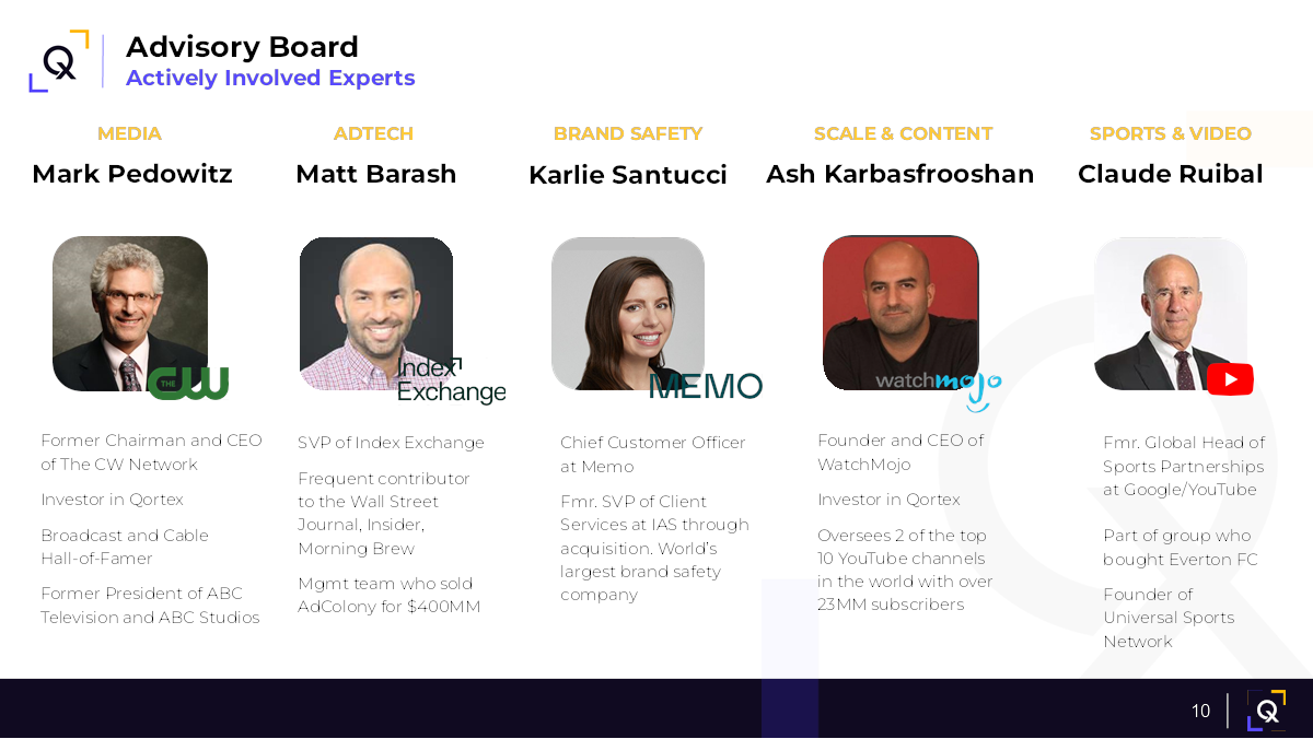
[Slide 10] That’s how you advisory board! Image Credits: Qortex

Qortex is being strategic by spotlighting the media expertise on its board, notably the former president of ABC Television and ABC Studios. This is not just about flaunting an industry titan’s backing; it’s a clear signal of Qortex’s access to invaluable insights and strategic guidance.

Featured prominently on slide 10, this roster underscores the company’s savvy in leveraging high-profile confidence in its vision. This advisory board also features the brains behind Universal Sports Network and other seasoned startup advisers, making for a veritable brain trust.

Indeed, it can be a strong competitive advantage to be able to say, “I have access to a deep bench of folks who have done this before and have a big Rolodex to connect us with the right people.”

The biggest takeaway from this slide is that you don’t have to do it all by yourself. Fill the gaps in your knowledge and experience with a board, and lean on them to tell the right stories.

Show, don’t tell

[Slide 6] Showing your product in action makes for solid storytelling. Image Credits: Qortex

Qortex demonstrates it knows how to communicate a story by quietly leveraging the power of video to show off its cutting-edge product. It’s a masterstroke in visual storytelling, showcasing not once, but thrice, the capabilities of its video analytics technology.

Slide 6 has a video offering a real-time glimpse into how the company discerns audience engagement and tailors marketing strategies accordingly. Slide 7 ups the ante with another video, this time illustrating the seamless integration of ads into the user experience. And slide 12 features yet another video cementing Qortex’s commitment to revolutionizing the intersection of technology and marketing.

Is it a bit much? Maybe, but it effectively answers many questions about how well the product works and the use cases it addresses.

A rising tide . . .

[Slide 4] Nobody wants to invest in shrinking markets, so Qortex did well to show that its market is growing. Image Credits: Qortex

Qortex does a good job of showing that the global video analytics market is growing and could prove lucrative. That’s important: All VCs want to see that a startup is operating in a space brimming with opportunity.

Sadly, the company only tells part of the story here. Yes, the market is growing, but Qortex leaves out some important bits: How much of that market it can expect to capture, and what the company’s growth trajectory could look like.

In the rest of this teardown, we’ll look at three things Qortex could have improved or done differently, along with its full pitch deck!

Three things that could be improved

Above, I noted the glaring absence of several key slides that investors usually like to see in a pitch deck. But with this deck, it’s not only about what’s missing; the existing slides desperately need to be refined as well. Let’s look at how Qortex can revamp some of these slides to elevate its pitch to the next level.

Is this a world-class team?

[Slide 3] So, about that team . . .  Image Credits: Qortex

The driving force behind any startup’s ability to raise money is the founding team’s capability to turn its vision into reality. Investors are keen on founders with deep expertise in their respective domains and prefer seasoned professionals with prior startup experience. They look for a blend of creativity and resilience, which is essential for navigating the unpredictable seas of startup life and making the crucial decisions that running a company demands.

Qortex’s team slide falls short of showcasing these traits by quite a bit.

The slide introduces the leadership team as industry pioneers, but it only has their photographs, names, and titles at the company. It leaves out essentially everything regarding the team’s actual credentials. For a startup in this field, one would expect the leadership team to have AI experts, tons of media experience, and even a sales wizard, but the slide provides no evidence of such prowess.

Moreover, being an early entrant in a market isn’t always a guaranteed advantage. While the slide does mention Qortex’s inception in 2020, its headcount of 22, and its collection of three awards, those details alone are insufficient to convince a venture capitalist to invest.

It’s such a waste, too, because the team’s LinkedIn profiles show that there’s a lot of experience to highlight. Rosenberg has experience in sales, Altschuler has worked at startups, and Tammaro has been developing software since 2005. Now, is this a team that’s going to earn a slam-dunk investment? No, but there’s certainly more to this team than this slide shows off.

Banish vanity metrics from your startup’s pitch deck

So, er, what is the solution?

[Slide 6] A slightly clunky solution slide. Image Credits: Qortex

Qortex omits a conventional “problem” slide, which casts a shadow of ambiguity over its solution slide here. This unconventional approach raises a question: Without a well-articulated problem, what exactly is Qortex’s solution addressing?

It appears Qortex is blurring the lines between a solution and a product demonstration in this slide. That isn’t really a problem from a storytelling point of view, but it does make the slide deck a lot less skimmable. VCs will often quickly click through a deck to form an initial impression of the company, so to catch an investor’s eye, the visual language and slide headings must be clear and consistent. In this deck, it’s hard to absorb the information quickly and completely.

This slide is a good illustration of why: Instead of delivering a succinct and impactful statement about the core offering — something like “Qortex simplifies the timing of brand marketing in videos” — the slide veers into a verbose discussion about categorization, correlation and curation.

This approach, while informative, is more a description of the product than a clear overview of the solution.

Where’s your traction?!

[Slide 13] Redacted or not, this is not the best way to show your traction. Image Credits: Qortex

Qortex claims that its marketplace is validated and used by major brands across the advertising supply chain on slide 13 but has redacted those clients’ names in the interest of privacy. Fair enough. So, assuming the company has a host of serious clients and considering that this pitch deck is being used to raise a good amount of money, Qortex is probably generating revenue.

What does this revenue look like? We have no idea. For traction, revenue is king, and by not talking about revenue, Qortex is making things much harder for itself.

If you have revenue, show it off. And if your revenue isn’t impressive, show it off anyway along with a plan for how you’re going to turn the ship around.

This deck actually doesn’t have a traction slide. Slide 8 — which is labeled “How Does On Stream Perform?” (On Stream is its “in-video experiences” product) — is probably closest to a traction slide, but instead of explaining its revenue and client retention figures with graphs, the company gives two statements about engagement and “viewability” for two users. Sure, having 2.3x better engagement on one platform compared to other providers is great, as is 6.8x better “viewability” (whatever that is) of ads compared to traditional ads on another platform. But these are very narrow metrics that don’t tell us much.

When you’re looking for funding to support the growth of your startup, you must be able to demonstrate that you have something to grow, and that comes in the form of traction. Use graphs to illustrate revenue, and even if you don’t want to disclose your actual customers, it’s crucial to show how many you have and the rate at which you’re increasing their number.

If you’re not doing that, I will always wonder why, and you’d best believe I’ll dig into that in a pitch.

The full pitch deck


If you want your own pitch deck teardown featured on TC+, here’s more information. Also, check out all our Pitch Deck Teardowns and other pitching advice, all collected in one handy place for you!

Pitch Deck Teardown: Kinnect's $250K angel deck

Image Credits: Kinnect

When Kinnect dropped a new app that’s all about preserving epic family tales and awkward holiday moments for generations to come, I knew I needed to take a closer look at its angel deck.

The app is clever and can be thought of as a digital family scrapbook on steroids. This app isn’t just about stashing photos; it’s also got video and audio recording, plus a nifty timeline feature to organize your memories like a pro. Kinnect’s grand plan is to make sure your grandkids get to hear straight from the source about that time Uncle Bob got stuck in a tree at the family reunion.

In a world where our heritage can get lost in the shuffle of everyday life, Kinnect is here to remind us that family stories are worth saving — and, of course, that’s all about storytelling. How well did the company tell its own story in the form of its angel pitch deck? Let’s take a look.


We’re looking for more unique pitch decks to tear down: here’s how you to get involved. Read all our 90+ Pitch Deck Teardowns here.

Slides in this deck

Cover slideTeam (founder) slideVision slideProblem slideProduct slideBusiness model and market size slideProblem impact slideMarket potential slideSolution slideWhy now / personal story slideTraction slide“Why will I win?” slide.Testimonial slide 1Testimonial slide 2

Three things to love about Kinnect’s pitch deck

The Kinnect pitch deck is playing on the heart strings in a big way, which is a great approach to storytelling when you are talking about startups that offer a human touch.

Powerful problem slide

[Slide 4] The problem slide is emotive, but a little fuzzy.
Image Credits: Kinnect

The problem slide in Kinnect’s pitch deck is compelling and well-executed. The team has clearly articulated a significant pain point, one that resonates deeply and is immediately relatable. The statistics cited are particularly impactful: Approximately 44 million American adults are significantly lonely, with about 30% of older adults feeling isolated. This alone paints a stark picture of the social isolation epidemic.

Even more powerful is the revelation that over half of Americans frequently feel misunderstood or unknown by those around them. The use of emotive and powerful language effectively underscores the urgency and magnitude of the issue, making it clear that this is a widespread and pressing problem.

However, while the problem identified is undeniably significant, it also feels somewhat nebulous. It’s hard to imagine a single product that can address all these diverse and deeply rooted issues of loneliness and disconnection. Tightening the focus of the problem statement might help in presenting a more cohesive and actionable solution. A slightly narrower and more focused problem could make the pitch even stronger and more believable.

Explain the impact of the problem

[Slide 7] Explaining how the problem affects people can help amplify things greatly.
Image Credits: Kinnect

The “Insights” slide in Kinnect’s pitch deck is a great example of powerful storytelling. By combining the problem with its impact, the team has effectively highlighted how big and important this problem really is.

Kinnect has painted a vivid picture of the problem’s effects, which helps investors understand the depth of the issue and dream big about the potential market for Kinnect. It makes the problem feel more tangible and sets the stage for the solution, showing that there’s a real and urgent need for what they’re building.

However, I also need to add that I don’t love this slide. Many parts of it can be seen as arguments against the app: Being unaware of existing solutions, for example, means that there may just not be a real market for this. And the differentiation between family and chosen family is a strange thing to highlight as an advantage. If distinguishing between the two is important to people, the competition could easily address this, so it isn’t as much of a competitive advantage as you might think.

A little more focus and clarity could help strengthen the argument.

A personal touch

[Slide 10] In addition to “Why now?” and “Why this?” adding a “Why you?” element to the story can be powerful. In this case, the personal stories help highlight why the founder has a connection to the problem the company is solving.
Image Credits: Kinnect

The “Why me?” type of information is typically included in the founder or team slide, but using it as a storytelling point here works well. Including the personal drive behind the venture can be incredibly powerful, as it explains why the founder will never give up on solving this problem.

Omar’s personal experiences — losing his grandfather to Alzheimer’s a few years ago and a friend to leukemia a month ago — are heart-wrenching and paint a vivid picture of his motivation. It shows that this is not just a business endeavor for him. It’s a deeply personal mission.

Founders, let’s get real. Every slide in your deck should scream, “Invest in me!” If it doesn’t, it’s dead weight. Sure, personal stories tug at the heartstrings, but investors aren’t here for that. They want to know why your sob story makes them money. The “Why Omar is doing this” slide? Sweet, but vague. If it doesn’t clearly tie back to why your company will crush it. It’s just fluff. Remember, if it doesn’t make an investor reach for their wallet, it doesn’t belong in your deck.

Three things that Kinnect could have improved

There’s a ton of information missing from the deck. Crucial details like the go-to-market strategy, user acquisition plans, specific team member credentials, and concrete milestones are absent. Filling in these gaps is essential to provide a comprehensive and convincing pitch. Use a checklist to make sure you have everything covered!

Dubious team

[Slide 2] 10 years of experience and passion is cool, but you’ve got to bring the receipts.
Image Credits: Kinnect

The “Founder” slide needs some polishing to really shine. Omar’s 10+ years of experience in performance brand and product marketing is impressive on the surface, but it’s crucial to tie that specific experience directly to Kinnect. Highlighting past roles or projects that are particularly relevant to the company’s mission would strengthen this slide significantly. Investors want to see how his background directly contributes to the success of Kinnect.

Omar doesn’t mention his last name anywhere in the deck, which raises a red flag. Investors need to be able to quickly look up and verify the founder’s background. Including his full name and a link to his LinkedIn profile would add credibility and transparency. Speaking of LinkedIn, it’s a bit concerning that Omar’s profile doesn’t reflect the 10 years of experience mentioned here. Ensuring that his LinkedIn is up-to-date and consistent with the information in the pitch deck is crucial. Investors will check, and inconsistencies can undermine trust. Without job titles and just a vague idea of how the founder’s past experience maps to the current venture, it’s all a bit fuzzy.

There also seems to be a lack of clear founder/market fit. The slide mentions a passion for storytelling, human connection and mental wellness, but it’s not immediately obvious how this translates into a strategic advantage for Kinnect. To wit: I, too, have a passion for storytelling, human connection and mental wellness, but I probably wouldn’t be a great founder for this particular startup. Get specific, connect the dots.

Drawing a direct line between Omar’s experience and the company’s goals will make this slide much more compelling. Adding more specific, verifiable information and making sure it’s consistent across all platforms would significantly improve the founder/market fit part of the story.

Pie-in-the-sky business model

[Slide 6] This is an aggressive bottoms-up market sizing. But I don’t believe it.
Image Credits: Kinnect

The “Subscription Model” slide presents an ambitious goal: a potential yearly subscription revenue of $204.8 million. That’s certainly venture-scale, so kudos for aiming high. However, there are several aspects that need further clarification and support.

My immediate response is that it’s going to be hard to find customers. I want to see predicates or comparable examples. This doesn’t feel like an urgent need, so showing other types of products or services that families are willing to pay $80 per year for would strengthen the argument. It’s essential to demonstrate that there is a precedent for this kind of spending — and I can’t think of any offhand.

The term “family” needs more definition in this context. What are we memorializing, and how does it resonate with potential users? It’s also unclear what Kinnect offers that can’t be accomplished by existing free services like Facebook. Basically, this deck doesn’t answer why families would choose to pay for Kinnect when they have free alternatives available.

Nowhere in the deck is there a go-to-market plan, which means that I’m further worried how the founders plan to convince customers to shell out $80 per year. Without a clear strategy, it’s difficult to see how they will reach and convert their target audience. Providing a detailed plan on customer acquisition and retention would make the deck far more compelling overall and this slide more believable.

Wait, this isn’t traction

[Slide 11] This isn’t really traction.
Image Credits: Kinnect

The “Traction” slide is supposed to showcase Kinnect’s progress, but it doesn’t quite hit the mark. Here’s why:

Stating that Kinnect is backed by TechStars through the Rising Stars Fund might sound impressive, but TechStars isn’t exactly in its golden era right now. Plus, raising money from an accelerator isn’t the slam dunk of traction it’s being made out to be. Investors want to see actual proof that people care about what’s being built, not just a pat on the back from an accelerator.

The slide claims the team is 100% working on Kinnect. What does that even mean? Have the founders quit their day jobs and are now living on ramen while they hustle? Founders being fully committed is the bare minimum; the slide should explain what this dedication has achieved.

There’s also the boast about recruiting a phenomenal founding team, but the team slide shows only one person, Omar. Where’s the rest of this supposed dream team, and what makes them phenomenal? Investors need names, roles and impressive backgrounds.

Then there’s the mention of being a member of Chicago’s 1871 innovation hub. Cool, but what does that actually mean? Why does being part of this hub give Kinnect a competitive edge? Without context, it’s just another buzzword.

None of these points really screams “traction.” Investors are looking for real, tangible progress, like user growth, revenue, partnerships — not fluff. It’s time to dig deeper and show the hard facts that prove Kinnect is on the path to success.

The full pitch deck


If you want your own pitch deck teardown featured on TechCrunch, here’s more information. Also, check out all our Pitch Deck Teardowns all collected in one handy place for you!

Pitch Deck Teardown: Qortex's $10M seed deck

Image Credits: Qortex (opens in a new window)

This week’s Pitch Deck Teardown comes to you from the PCB-laden confines of CES in Las Vegas. Today, we’re looking at the slide deck that video analytics firm Qortex used to raise a $10 million seed round. Qortex uses AI to help brands, media companies and creators identify the right moments in a video to insert an ad and maximize engagement, so this is going to be a fun one.

So, without further commercial interruptions or preamble, let’s get to it. 


We’re looking for more unique pitch decks to tear down, so if you want to submit your own, here’s how you can do that.


Slides in this deck

Qortex has shared its 13-slide deck in full with just its client list redacted.

As you can see from the list below, the deck is missing quite a few of the slides that you’d expect to find in a fully fleshed out deck. There’s no “ask” or “use of funds” slides, no problem statement, no go-to-market strategy, and no business model or pricing slide, among others. To be honest, I’m a little surprised the company managed to raise money at all with this pitch deck, but the fact that it did manage to raise $10 million is a good reminder that the deck is only one part of the puzzle. The conversations you have and collateral you share outside of the deck itself are all part of the fundraising process. 

The slide deck comprises:

Cover slideMission statementTeam slideMarket size slideInterstitial slide: “Focus on the media sector”Solution slideProduct slideTraction slideFuture plans slide  Advisers slide  How it works slide  Entry into connected TV space slide  Clients

Three things to love

Besides the omissions mentioned above, Qortex’s deck has some weak slides, too. I had to dig deep to find things that I truly love or admire about this deck, but I did find some slides worth celebrating:

A stellar team of advisers

A large part of the fundraising process involves answering questions about edge cases and scenarios, and even the most experienced founders can feel a little stuck. That’s when it’s helpful to have an extraordinary list of resources to draw on — and your board, whether it’s an advisory board or your board of directors — is a good group of people to have in your back pocket.

And Qortex has surely collected an impressive group here:

[Slide 10] That’s how you advisory board! Image Credits: Qortex

Qortex is being strategic by spotlighting the media expertise on its board, notably the former president of ABC Television and ABC Studios. This is not just about flaunting an industry titan’s backing; it’s a clear signal of Qortex’s access to invaluable insights and strategic guidance.

Featured prominently on slide 10, this roster underscores the company’s savvy in leveraging high-profile confidence in its vision. This advisory board also features the brains behind Universal Sports Network and other seasoned startup advisers, making for a veritable brain trust.

Indeed, it can be a strong competitive advantage to be able to say, “I have access to a deep bench of folks who have done this before and have a big Rolodex to connect us with the right people.”

The biggest takeaway from this slide is that you don’t have to do it all by yourself. Fill the gaps in your knowledge and experience with a board, and lean on them to tell the right stories.

Show, don’t tell

[Slide 6] Showing your product in action makes for solid storytelling. Image Credits: Qortex

Qortex demonstrates it knows how to communicate a story by quietly leveraging the power of video to show off its cutting-edge product. It’s a masterstroke in visual storytelling, showcasing not once, but thrice, the capabilities of its video analytics technology.

Slide 6 has a video offering a real-time glimpse into how the company discerns audience engagement and tailors marketing strategies accordingly. Slide 7 ups the ante with another video, this time illustrating the seamless integration of ads into the user experience. And slide 12 features yet another video cementing Qortex’s commitment to revolutionizing the intersection of technology and marketing.

Is it a bit much? Maybe, but it effectively answers many questions about how well the product works and the use cases it addresses.

A rising tide . . .

[Slide 4] Nobody wants to invest in shrinking markets, so Qortex did well to show that its market is growing. Image Credits: Qortex

Qortex does a good job of showing that the global video analytics market is growing and could prove lucrative. That’s important: All VCs want to see that a startup is operating in a space brimming with opportunity.

Sadly, the company only tells part of the story here. Yes, the market is growing, but Qortex leaves out some important bits: How much of that market it can expect to capture, and what the company’s growth trajectory could look like.

In the rest of this teardown, we’ll look at three things Qortex could have improved or done differently, along with its full pitch deck!

Three things that could be improved

Above, I noted the glaring absence of several key slides that investors usually like to see in a pitch deck. But with this deck, it’s not only about what’s missing; the existing slides desperately need to be refined as well. Let’s look at how Qortex can revamp some of these slides to elevate its pitch to the next level.

Is this a world-class team?

[Slide 3] So, about that team . . .  Image Credits: Qortex

The driving force behind any startup’s ability to raise money is the founding team’s capability to turn its vision into reality. Investors are keen on founders with deep expertise in their respective domains and prefer seasoned professionals with prior startup experience. They look for a blend of creativity and resilience, which is essential for navigating the unpredictable seas of startup life and making the crucial decisions that running a company demands.

Qortex’s team slide falls short of showcasing these traits by quite a bit.

The slide introduces the leadership team as industry pioneers, but it only has their photographs, names, and titles at the company. It leaves out essentially everything regarding the team’s actual credentials. For a startup in this field, one would expect the leadership team to have AI experts, tons of media experience, and even a sales wizard, but the slide provides no evidence of such prowess.

Moreover, being an early entrant in a market isn’t always a guaranteed advantage. While the slide does mention Qortex’s inception in 2020, its headcount of 22, and its collection of three awards, those details alone are insufficient to convince a venture capitalist to invest.

It’s such a waste, too, because the team’s LinkedIn profiles show that there’s a lot of experience to highlight. Rosenberg has experience in sales, Altschuler has worked at startups, and Tammaro has been developing software since 2005. Now, is this a team that’s going to earn a slam-dunk investment? No, but there’s certainly more to this team than this slide shows off.

Banish vanity metrics from your startup’s pitch deck

So, er, what is the solution?

[Slide 6] A slightly clunky solution slide. Image Credits: Qortex

Qortex omits a conventional “problem” slide, which casts a shadow of ambiguity over its solution slide here. This unconventional approach raises a question: Without a well-articulated problem, what exactly is Qortex’s solution addressing?

It appears Qortex is blurring the lines between a solution and a product demonstration in this slide. That isn’t really a problem from a storytelling point of view, but it does make the slide deck a lot less skimmable. VCs will often quickly click through a deck to form an initial impression of the company, so to catch an investor’s eye, the visual language and slide headings must be clear and consistent. In this deck, it’s hard to absorb the information quickly and completely.

This slide is a good illustration of why: Instead of delivering a succinct and impactful statement about the core offering — something like “Qortex simplifies the timing of brand marketing in videos” — the slide veers into a verbose discussion about categorization, correlation and curation.

This approach, while informative, is more a description of the product than a clear overview of the solution.

Where’s your traction?!

[Slide 13] Redacted or not, this is not the best way to show your traction. Image Credits: Qortex

Qortex claims that its marketplace is validated and used by major brands across the advertising supply chain on slide 13 but has redacted those clients’ names in the interest of privacy. Fair enough. So, assuming the company has a host of serious clients and considering that this pitch deck is being used to raise a good amount of money, Qortex is probably generating revenue.

What does this revenue look like? We have no idea. For traction, revenue is king, and by not talking about revenue, Qortex is making things much harder for itself.

If you have revenue, show it off. And if your revenue isn’t impressive, show it off anyway along with a plan for how you’re going to turn the ship around.

This deck actually doesn’t have a traction slide. Slide 8 — which is labeled “How Does On Stream Perform?” (On Stream is its “in-video experiences” product) — is probably closest to a traction slide, but instead of explaining its revenue and client retention figures with graphs, the company gives two statements about engagement and “viewability” for two users. Sure, having 2.3x better engagement on one platform compared to other providers is great, as is 6.8x better “viewability” (whatever that is) of ads compared to traditional ads on another platform. But these are very narrow metrics that don’t tell us much.

When you’re looking for funding to support the growth of your startup, you must be able to demonstrate that you have something to grow, and that comes in the form of traction. Use graphs to illustrate revenue, and even if you don’t want to disclose your actual customers, it’s crucial to show how many you have and the rate at which you’re increasing their number.

If you’re not doing that, I will always wonder why, and you’d best believe I’ll dig into that in a pitch.

The full pitch deck


If you want your own pitch deck teardown featured on TC+, here’s more information. Also, check out all our Pitch Deck Teardowns and other pitching advice, all collected in one handy place for you!

Pitch Deck Teardown: Xyte's $30M Series A deck

Image Credits: Xyte (opens in a new window)

When I was a student in the U.K., I remember that renting appliances like washing machines and televisions was the norm for some people, especially students living in short-term accommodations. Israeli startup Xyte (pronounced “excite”) has just raised $30 million, as it sees a return to this sort of hardware-as-a-service model to be the way forward for manufacturers whose margins are under constant pressure. If it works so well for software-as-a-service, why not hardware?

Xyte let me take a look at its 27-slide deck to see how it pulled it off. Was I excited by Xyte’s deck? Sadly, no. This 27-slide deck was short on the information that I would need as an investor to make an informed decision on whether or not to invest in it. Let’s break down what I saw.


We’re looking for more unique pitch decks to tear down, so if you want to submit your own, here’s how you can do that.


Slides in this deck

Xyte’s deck features 27 slides, some with redacted information. The redactions relate to its customers and trading figures, which is both fair enough and also makes it a bit trickier to get a picture of the full company.

Cover slideCompany overview, including some team detailsTeam slideOpportunity slideOpportunity 2 slideMarket slideProblem slideValue proposition slideSolution slide  Solution 2 slide  Solution 3 slide  Dedicated interfaces slide  Traction slide  “Any industry, any size” slide (customer base)  Value proposition slide  Business transformation slide  “Unique business and commerce platform” slide  Customer study slide  “Pioneering a new product category” slide  “A single, integrated platform” slide  Team 2 slide  Interstitial slide  Business model slide  Go-to-market slide  “Forecast and drivers” slide  Investment summary slide  Closing slide

Three Two things to love

You might think that with 27 slides, there would be plenty to pick from for the “three good things” section. Dear reader, I’m not gonna lie: Try as I might, I really struggled to find three good things about this deck.

So, let’s talk about the two sparks of brilliance I could spot in this inky void of despair:

Opening summary

[Slide 2] A very well-done at-a-glance slide. Image Credits: Xyte

Xyte’s slide deck, overall, was a pretty underwhelming cavalcade of mediocrity. Still, I did really enjoy this one-slide summary right at the beginning.

Even with some of the core numbers redacted, it shows off a lot of important information at a glance that will likely get an investor to take note. In fact, I think this slide will become my recommended template for most startups raising money — it’s crisp, clear, and to the point, and it helps set the scene for what’s to come.

Pulling it all together

I have a lot of respect for summaries, and this deck pulled it off not once, but twice. The first one sets the stage, and the second one (below) summarizes the same story once more, but through the lens of an investor.

[Slide 26] A solid summary pulling it all together. Image Credits: Xyte

I really like the way the team did this. Illustrating that the company has figured out a problem and go-to-market strategy that makes sense is great. So good, in fact, that I’m going to look at each of these points separately:

Enormous opportunity: Yes! A startup has to reach “VC scale” in order to be investable at all. It might have been worth it to remind the investor of the actual market size here, but this slightly more abstract summary works well.Unique solution: Yes! Including a reminder of what you actually do is great.World-class product: I’d have loved to see this point backed by data, to be honest. Is it a world-class product? Maybe, but bring the receipts!Validated solution: Sure, but remember to include the why. What validates this solution? I suspect the point the company is truly trying to make here is related to the next point . . .Scalable GTM strategy: Being able to acquire customers at scale is what causes a startup to stop being a startup, and that’s a good thing. For bonus points, I’d have reminded the investors of the CAC:LTV ratio here, but it’s a damn fine start.Vision: Meh. This isn’t a reminder of the company’s vision, which is a missed opportunity. Perhaps, instead, it could have swapped in a team summary to remind the investors why this is the right team to build this company.

Minor tweaks aside, I think this “investment summary” slide does a lot of work, and I’m glad the team chose to include it.

In the rest of this teardown, we’ll look at three things Xyte could have improved or done differently, along with its full pitch deck!

Three things that could be improved

As you might have expected, the inverse of struggling to select three good things from 27 slides is an abundance of not-so-great slides. It wasn’t easy to choose, but here are some of the ones that really stood out.

The curse of the illustrative graph

[Slide 13] Welcome to the illustration graph. Image Credits: Xyte

I love a good graph. This isn’t one of them. Even with a heavily redacted slide without the actual milestones and axis information, this slide comes up short. I see these types of performative, illustrative graphs in decks quite a lot, and they are utterly meaningless.

If you’re going to chart data, chart real data. It’s never this smooth and predictable. These kinds of pretty, well-rounded charts just feel dishonest; I know you have better data than that. Use it, show it off. Don’t risk creating the impression that you’re trying to hide anything.

This split team slide needs to go

Somehow, slides 3 and 21 are both team slides. They are separated by almost a full pitch deck, but neither (individually or together) helps explain what an investor needs to understand.

[Slide 3] A part of the team. Image Credits: Xyte
[Slide 21] A part of the team. Image Credits: Xyte

I honestly don’t see the point of either of these slides because they don’t meet the sniff test for fundraising: The question you are trying to answer is, “Why is this the perfect team to back with $30 million?” A bunch of pictures with names and job titles isn’t going to cut it.

And then adding a slide similarly lacking in information, but of more junior staff (who your investors are absolutely going to give zero craps about), is just a waste.

Help me understand:

Why is this team inherently a part of your competitive advantage?Why would I be crazy to invest anywhere else?What skills and experience does this team have that nobody else does?

Neither of these slides helps tell that story, and it’s so easy to do a lot better.

The Team Slide is the most important slide in a startup pitch deck

That’s . . . not a go-to-market slide

[Slide 24] The slide says “go to market,” but it doesn’t explain how. Image Credits: Xyte

If you’re going to be out there raising $30 million, I’d want to see a solid and detailed go-to-market plan based on data from existing sales and extrapolating that into the future. If you’re doubling your sales team, are you doubling your sales? Tripling it? If you spend 3x more on marketing, will that result in a proportional increase in revenue?

This slide is barely a functioning brainstorm.

A much better way to do it would be to cover some, or ideally, all of the below:

Target customers: It’s crucial to understand your target customers by conducting thorough market research. Analyze their behaviors, preferences, challenges and how they currently solve the problems your product aims to address. This enables you to tailor your product and messaging to meet their specific needs. It makes you a safer investment overall, too.Customer acquisition strategy: Expand on the tactics you will use to attract these customers. What’s the top of funnel (presumably a mix of digital marketing, content marketing, partnerships, and sales strategies)? Provide details on the platforms you will use and why they are effective for reaching your target market, with cost implications.Customer acquisition cost (CAC): Analyze your customer acquisition costs in depth by considering all associated expenses, including marketing, sales and any discounts or incentives. Benchmark these costs against industry averages and detail strategies to optimize and reduce CAC over time.Expansion and scalability: Discuss your expansion plans with a focus on how you will scale operations, technology and the team to support growth. Include potential challenges and how you plan to address them. Highlight pilot projects or market tests that validate your expansion strategy.Financial projections and metrics: Offer detailed financial projections that account for revenue growth, margin improvements and cash flow. Explain the assumptions behind your projections, such as market size, penetration rates and pricing strategy. Also, discuss the key performance indicators you will track to measure success and make informed decisions.

Incorporating these details into the pitch will demonstrate a comprehensive understanding of your business model, market, and growth strategy. And that, dear founders, is what a great go-to-market slide would look like.

The full pitch deck


If you want your own pitch deck teardown featured on TC+, here’s more information. Also, check out all our Pitch Deck Teardowns and other pitching advice, all collected in one handy place for you!

Pitch Deck Teardown: Equals' $16M Series A deck

A pitch deck with the cover text "Equals" and "A modern spreadsheet for modern analysis". Also: The TechCrunch+ Pitch Deck Teardown logo.

It’s a rare startup that tears down its own pitch deck, but that’s exactly what Equals did after it raised a $16 million Series A round. Equals’ mission is not to replace the spreadsheet, but to ensure that a spreadsheet can do whatever its users throw at it. As an inveterate spreadsheet user, this is an approach that I can get behind — I’ve built entire software solutions with extremely complex spreadsheets as the back end.

Furthermore, as a pitch deck connoisseur, I can also get behind the bright and bold design of Equals’ deck.

I particularly enjoyed a take I’ve not often seen in deck design, which is breaking down the deck into two different sections: a pitch deck and a data deck. The latter provides a breakdown of the company’s financials over seven slides, showing ARR, lead-to-customer conversion rates, churn, and other figures. It’s a good idea: I often advise startups to tell the story with words, then tell the same story with numbers.

Let’s see what else there is to love about this deck.


We’re looking for more unique pitch decks to tear down, so if you want to submit your own, here’s how you can do that.


Slides in this deck

Figures from the two traction slides were redacted, and there is a lot of (redacted) data in a separate data deck. There are no market size and go-to-market slides either, but we’ll get to that later.

Cover slideOpening statementMission slideProblem slideSolution/mission slideProduct (“Meet Equals”)Product demo slideProduct validation slideTraction slide  Traction 2 slide  Product highlights slide  Product roadmap slide  Team slide  Ask and use of funds slide  Closing slide

Three things to love

I’ve already given Equals kudos for the design, but this deck is striking enough that it’s worth mentioning again: This is a good-looking deck. Here are a few other things that stood out to me:

Making it real

For a while, it’s seemed as if the easiest way to build a successful software startup was to find something people use Excel for, then build a tool that’s better, more focused and easier to use. That’s worked well for countless businesses, so it’s a bold undertaking to take on Excel at its home turf, by replacing a spreadsheet with . . . a spreadsheet. Airtable has had some success in this space, so one of the first things that springs to mind is whether there is room for another company in this vertical.

Equals makes a comprehensive and compelling argument for a resounding yes to that question by listing out a number of use cases for its software:

[Slide 4] Here’s a problem slide for you . . .  Image Credits: Equals

The problem seems real enough, but it seems largely to do with the provenance of data and data analysis/algorithms. And sure, Excel files can be challenging, but Excel itself has a relatively robust online solution as well now (so the statement “Excel has not” feels slightly hyperbolic). We also have Google Sheets, Airtable and a ton of other potential competitors in the space.

Still, in the dry and boring world of spreadsheets, this is probably the most fun way to outline the problem you’re trying to solve. I like it!

So it’s Excel, but more online

[Slide 6] Here’s where the magic happens. Image Credits: Equals

Founders, especially technical founders, often face a tremendous challenge when trying to explain what their startup does in simple terms. I’m really impressed that Equals’ team managed to distill the product down to something this simple: Spreadsheets, but with database connections and collaboration. That very simple statement hides a lot of technical complexity and what must have been an absolute nightmare of an integration challenge.

But hiding the complexity is a great idea: The end users don’t want to know why their spreadsheet won’t connect to the Stripe data source. They just need it to work.

Quite elegant. Very well done.

That’s how you map a path to the future!

[Slide 12] Such a great way to map your near future. Image Credits: Equals

Investors rarely care about this level of granularity in your product roadmap, but they’re not uncurious, you know? This is a great rough overview of what you care about and doesn’t go into the weeds about the nuts and bolts of what the engineering team will be building.

Even though this plan is pretty technical, I’m impressed by the team’s ability to resist the temptation to go into too much here. I’ve no idea what they’re going to link Command + K to, but it doesn’t really matter — this is a great top-level view that will let you have a board-level conversation about the product priorities for the next year.

Equals has also done something clever with the preceding slide: Slide 11 shows the features that have already been built, which then allows the narrative to flow evenly to this slide (with the existing features now highlighted in gray). This lets you have a two-step conversation about the product: Talk about everything you’ve built, then talk about everything you’re going to build and how that helps the product become more relevant to your target audience — and maybe expand the potential user base as well.

As a startup, you can learn from this slide that you should not spend too much time on your product. These two slides are a great example of how you can sidestep that problem with finesse.

Stop spending so much time on your product when pitching to investors

In the rest of this teardown, we’ll take a look at three things Equals could have improved or done differently, along with its full pitch deck!

Three things that could be improved

It’s not all rainbows and unicorns in Equals’ deck . . .

Be mindful of your audience

A pretty common problem with pitch decks is that it’s sometimes hard to tell whether the founders understand who they are talking to. Check out this testimonials slide:

[Slide 8] Yeah, but do the investors care? Image Credits: Equals

I have no doubt that this is a powerful slide to use in the company’s sales operation when talking to new clients. But I’m not sure how effective it is as part of an investment pitch.

I can see several issues here:

I don’t know what any of those logos are. Okay fine, I recognized Notion, but I have no idea what Levity is or does, and I don’t recognize the V logo. That means that two of the three logos on this slide aren’t helping convince me to invest. So why use them?Two quotes and one unaccredited set of statements don’t really serve as a particularly strong set of testimonials.In the final testimonial, the line “I don’t see it going anywhere anytime soon” can be easily misconstrued. I’m assuming the person meant that their product is here to stay, but that’s not 100% clear from the quote.It’s poor form to have quotes without properly attributing them to someone. Who said these nice things? If it were the CTO of a company, you should definitely highlight that. Think about it this way: If you attribute “This is a really good product” to “an Apple employee,” would that be a good thing? If Tim Cook said it, that’d be pretty great. If some random sales flunky in an Apple Store said it . . . you know what I’m getting at.

Overall, this slide seems neutral at best — at least when it comes to convincing an investor to invest. So it’s probably safe to just leave it out of the deck altogether.

So . . . how big is this market?

Perhaps I’m picking at nits here. Ask any investor, “If I can steal 30% of Excel’s business, is the market big enough?” and you’ll probably get a resounding yes.

The thing is, this deck is also missing a go-to-market slide. That means Equals is missing out on two opportunities to tell investors how it is thinking about its market. Who are the customers? How many of them are there? What is the value prop? How do you reach these customers? How do you convince them to stay? You’ll need to answer that cadre of questions to successfully raise money — and it’s a little thin on the ground in this deck.

If you’re going to market, your GTM slide needs to be awesome

What are the goals, though?!

[Slide 14] Erm, sure, but this is way too vague. Image Credits: Equals

Investors are not looking for a ballpark figure or a vague plan when it comes to how your startup will use the funds raised. A well-crafted “use of funds” slide does more than just list expenses; it builds trust. By being transparent about your financial needs and how they align with your business goals, you’re showing potential investors that you’re not just another startup looking to burn cash. No, instead, you’re a serious entrepreneur with a plan for growth and a clear vision for the future.

I know many founders stumble on this critical slide. Glamorous but unnecessary expenses, a nebulous abyss of “miscellaneous” costs, and vague descriptions of how the funds will be used are just a few common pitfalls that can turn investors away. Equals falls prey to such a trap: None of these goals are nearly specific enough. The slide should be as clear and detailed as possible, avoid generalizations, and focus on specific, measurable, achievable, relevant and time-bound (SMART) goals.

“Scale marketing”: Sure, but to what?“Scale success”: Yes, but what’s the goal? How do you know you’re successful?“Accelerate pace”: Well, yes, but if you wrote 10 new pieces before the fundraising and managed 11 afterward, you’ve hit that goal.

Be specific. Use your “use of funds” slide well. This is not the time for abstraction, but for bold, specific, quantified audacity. This slide is where you spell out your vision in dollars and cents, and if you do it correctly, it’s where investors will begin to see their futures aligning with yours.

Crucially, a well-designed “use of funds” slide helps paint the picture for your next funding round. If you hit all the goals, can you raise the Series B? Great! Does your plan set you up for success? Fantastic!

This slide is almost useless, which is such a shame. Greater precision here would make fundraising so much easier.

The full pitch deck


If you want your own pitch deck teardown featured on TechCrunch, here’s more information. Also, check out all our Pitch Deck Teardowns all collected in one handy place for you!

Pitch Deck Teardown: CommandBar's $4.8M seed deck

Command Bar

Image Credits: Command Bar (opens in a new window)

CommandBar, a B2B tool designed to make software easier to use, closed a $4.8 million raise in 2021 with one of the most starkly minimalist decks I’ve ever seen. The deck only has seven slides and is missing a ton of really important information, but that didn’t stop Thrive Capital and Y Combinator from opening their checkbooks.


We’re looking for more unique pitch decks to tear down, so if you want to submit your own, here’s how you can do that. 

Slides in this deck

Cover slideProduct slideDemo slide (with a link to a Loom demo)Thesis slideProblem/competitive landscape slideValue proposition slideTeam slide

Three things to love

In the midst of a pretty slim pitch deck, there are some innovations that are worth shining a light on.

Info design, not graphic design

I’ve long held that design is far less important than people seem to think when it comes to early-stage pitch decks. This makes sense: The primary purpose of a pitch is to communicate the startup’s potential to would-be investors. These elements are fundamentally rooted in the content and clarity of the message rather than the aesthetics of the presentation.

That doesn’t mean that design isn’t important, but startups would do well to pay attention to information design (i.e., whether the content is easy to ingest and read), rather than graphic design; early-stage investors are predominantly focused on substance over style. They are looking for compelling business ideas with strong market potential and teams capable of executing those ideas.

Focusing too much on design can often misallocate precious early-stage resources. Startups typically operate under tight budget constraints, and spending significant time and money on pitch deck design may not be the best use of limited resources. The time and effort could be better spent on validating the business idea, conducting market research and refining the product or service. If you have a talented designer on staff, by all means, let them loose on the deck, but be aware that great pitch deck design is a highly specialized niche in its own right, and other design disciplines may not be as transferable as you think.

CommandBar sidesteps this by essentially not designing the deck at all. In doing so, the company created a stark, easy-to-ingest stack of slides.

[Slide 1] How’s that for minimalism. Image Credits: CommandBar

If you’re on revision 900 of your pitch deck, and you can’t get the design quite right, perhaps less is more.

Elegant combo of problem and competitive landscape

In my many years of poring over pitch decks, I can’t say I’ve seen the problem slide combined with the competition slide before, but in this case, it just works:

[Slide 5] These go well together. Image Credits: CommandBar

Startup founders are always looking for ways to make their pitch deck stand out to potential investors. In this case, CommandBar created a fresh take by merging its competitive landscape and problem slides.

Yes, the design is utilitarian, but the combination of the two slides sharpens the presentation and helps do something unusual: It cohesively shows the company’s deep market understanding and the solution’s unique value.

The most effective part of this slide is that it shows that CommandBar can take on some truly enormous markets. The company doesn’t have a market size slide (boo!), but the examples on this slide give us an idea: WalkMe has an $830 million market cap. According to PitchBook data, Zendesk last raised at a $10 billion valuation. As of its last investment round, Intercom and FullStory were valued by investors at $900 million and $1.8 billion, respectively. Back-of-a-napkin math says CommandBar is going after a market of at least $13 billion. Not too shabby.

I do want to underscore that while integrating these slides offers some benefits, clarity is key. Ensure the slide is not overcrowded with information. The aim is to enhance understanding and engagement, not to confuse. Careful design and content selection are crucial to making this strategy work — and remember that more and more VCs are using AI to read pitch decks to do first-sifts. My own AI-based pitch deck tool was confused by this slide, incorrectly identifying it as a customer slide. Your mileage may vary, but your pitch deck does need to be machine-readable.

Your pitch deck needs to be machine-readable

Simplicity

A lot of founders get stumped trying to express what the company is doing and who it is doing it for. That makes sense: Of course a startup is complicated and full of nuance. But investors don’t need that level of in-the-weeds precision, especially not the first time they look at a startup. CommandBar’s second slide cuts through the temptation of complexity, offering up the following:

[Slide 2] Distill your purpose in as few words as you can. Image Credits: CommandBar

It’s unusual that a product-led pitch works well, but CommandBar is different here, too. Being a “search-based interface for interacting with software” explains the what, and enabling “web apps to configure command bars” explains the how. “Leveling up their UX” shows why CommandBar can benefit companies. This is great, and shows that the founders really understand CommandBar’s why.

Three things that could be improved

Clever innovations aside, there’s a lot to be desired with this deck.

The team slide doesn’t have a team on it

[Slide 7] Where is the team? Image Credits: CommandBar

Princeton, McKinsey, Bain Capital, AngelList are all impressive, but nothing about this slide suggests why CommandBar’s founding team is the best team to run this company. And that’s not all; the team slide is often the most important slide in a deck. It should highlight the team’s deep experience, connections or anything else that gives this particular startup a competitive edge.

The Team Slide is the most important slide in a startup pitch deck

There’s missing information

The deck doesn’t include enough information to know whether it’s venture scale. There’s no real sense of how big the market is. There’s no ask or use of funds. The team is missing. There’s no financial plan, no business model, and no go-to-market plan. There’s no clear pricing or unit economics. There’s no clarity around who the target customers are, how this company might be defendable, or why now’s the right time to start the company.

Image Credits: Haje Kamps

For reference, my AI-powered pitch deck tool gave this deck a 16.9% chance at raising funding.

You need traction

CommandBar’s deck has no real traction metrics, which isn’t great. Even if there’s no revenue, at least some work has been done to de-risk the company. That’s the traction; report it and show it as graphs.

The fundraising stages are not about dollar values — they’re about risk

So, what happened?

It’s likely that CommandBar raised its round without a deck at all and that investors came into the pitch knowing more about the company than we see here. Perhaps the team is extraordinary, and the investors knew that because they invested in a previous company, or have had exposure to the founders in the past. Perhaps the company did a compelling demo when it was in Y Combinator.

I asked the founding team about what actually happened.

“Vinay, Richard and I are overthinkers, so before writing our seed deck we created some principles,” said CommandBar’s CEO and co-founder, James Evans. The company took an unusual tack: “We looked at our seed deck as a memo to ourselves of why we — self-proclaimed smart people who could do a bunch of other things with their time — should invest the next decade+ of our blood, sweat and tears into this company. If that were clear and we could reasonably convince ourselves, conveying that message to attract capital should be easy. And if it weren’t . . . then why were we wasting time trying to raise money for this company to begin with?”

Evans actually tore down the company’s deck himself in a recent blog post, which makes for a good behind-the-scenes read (I hadn’t read it before I wrote my teardown above). He told me that while the company may or may not be raising another round of funding (shhhh), it did raise its next round without a deck, saying “it wasn’t a traditional process.”

“We led the A because of a continuation of factors that were present at the seed — a team with great ambition + clear thinking, and a product that customers loved and you could see becoming ubiquitous,” said Itai Tsiddon, when TechCrunch asked him how the Series A round came together. “The stellar early customer traction, with some marquee logos, certainly helped!”

The full pitch deck


If you want your own pitch deck teardown featured on TechCrunch, here’s more information. Also, check out all our Pitch Deck Teardowns all collected in one handy place for you!